


 |
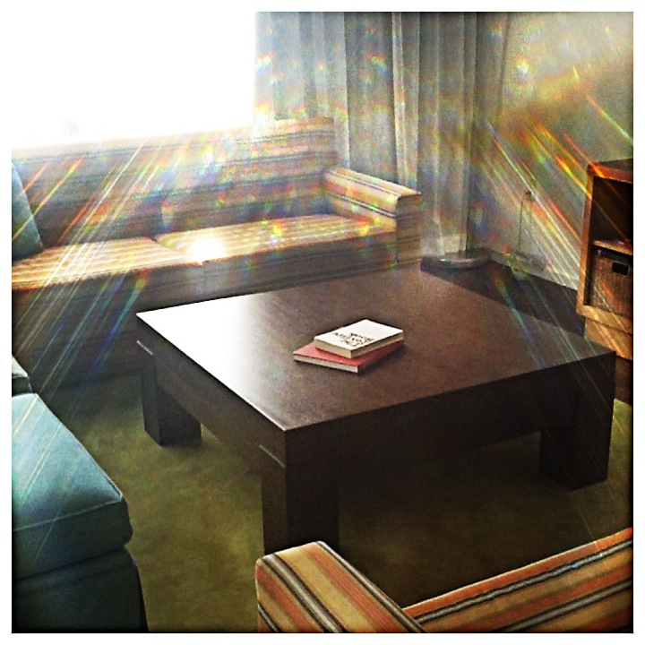
| Since I didn't use a "coffee table" space for my first implied space, I used this coffee table space to show implied space. |
 |
| There is implied space between the people as well as the around the "hammock". |
.JPG)
.JPG)
.JPG)
.JPG)
.JPG)
.JPG)
.JPG)
 |
| 1. The ostrich skin of this chair has raised spots and a leather feel, giving the chair an actual texture. 2. This burlap pillow gives a hard, rough texture to the interior space. 3. This shag rug gives texture to the wood floor. 4. This exposed brick wall gives a hard, rough texture to the walls. |
 | |
| 1. This leopard pillow appears to have a fur texture but is actually needlepoint. 2. This potted plant has faux-dirt, meaning what appears to be dirt is actually plastic in the pot. 3. This table appears to be made of real wood but it is actually linoleum. 4. This counter top appears to be granite but it is actually Formica. |
 |
| 1. The pool table mixed with the poster-like artwork and high back chairs add variety to this sitting space. 2. The wooden tv stand with wicker baskets is an overwhelming piece in the room. It is offset by the variety of smaller scale elements such as the music stand and modern lamp. 3. The old apothecary jars of different sizes are off-setting to the stainless steel new age refrigerator. 4. This table is made using a variety of materials: granite and recycled wood. It is placed among leather couches with burlap pillows. |
 |
| 1. The way these benches are set up to have the cross as the center creates unity. They seem to unite people under one common element. 2. The trees are planted in rows along this mall of this campus. It seems to create harmony and lead the eye along to the chapel. 3. The simple backdrop of this picture with the farm life and the skies represent harmony through evoking that emotion. 4. The simple color scheme of light blues, greens, and red create harmony in the decor. |
 |
| 1. This house represented scale and proportion because, although the two "sides" appear different from the front, they are the same height and could be split down the middle in equal proportions. 2. The facade of the entrance to this stadium had almost identical proportions and scale. Each side has the same windows, logos, and landscape. It could be split right down the middle and appear equal on both sides. 3. This sink, while a little off-center, shows how the sinks are proportionate to one another. 4. The sitting area in this lobby has proportionate elements. The middle chair could be split in half and both sides would appear to be balanced. |
 | ||
| Geometric: 1. This chandelier creates a globe form crafted out of metal. 2. This wooden stump stool creates a geometric form when looked at from a top angle. 3. This wood end table creates a rectangular geometric form. 4. This couch, along with the pillows, create a geometric form. |
 |
| Natural: 1. These lavender bushes create a natural form by the way they are planted along this path. 2. This stool, made from a stump of a tree creates a natural form because each stool is a little bit different than the next one. 3. This pile of discarded wood and trees creates a natural form. 4. The way the two trees almost rest on one another creates a natural form. |
 |
| Abstract: 1. The way the two pieces of wood rest on each other create an abstract form. If we altered their position slightly, a completely different shape would appear. 2. This table made with granite and recycled wood creates an abstract form if looked at from different angles. 3. These metal disks are linked together to create an abstract form of art in the way they are molded. 4. I used this stool again to show an abstract form because the stool practically changes shape depending on the way you lay it. From the side, the stool appears to have an abstract form. |
 |
| Non-Objective: 1. These metal disks take on a non-objective form because they do not take on any recognizable shape. 2. Shadows will take on a non objective form because they can change with each step that a person takes. 3. This structure is a non objective form because they are each different and do not take on a particular shape. 4. This tomato takes on a non objective form because each slice can take on a different shape and may never be the same form twice. |
 |
| Static: 1. This arch symbolized static to me because it seems to represent power and permanence on the campus. 2. The structure of the beds are static because they are still and provide a sense of calm and peacefulness. 3. These beds also seem to represent static because they are just boring and calm without too much color emphasis. 4.This piece of furniture is static because it is a very horizontal shape that is a resting place for objects. |
 |
| Dynamic: 1. This stair case is dynamic because it inspires movement throughout the space. 2. This coffee shop counter is dynamic because it shows activeness throughout the space. 3. The piano and bright colored chairs in the space are dynamic against the lightly painted walls. Energy seems to be created by the piano in the room. 4. Movement is implied throughout the circle of chairs and the row of table behind it, making the space seem dynamic. |
 |
| Actual: By seeing both of these walls in the picture, we can see that this is intended to be an actual space such as a living area. |
 |
| Implied: These tables create an implied eating space but the leather chair in the corner shows how the space could be used for just some type of sitting room. The walls of windows also create an illusion that opens up the outside instead of being enclosed in walls. |
 | |
 |
| Asymmetry |
 | |||||||||||||
| Radial |


.JPG) |
| Abstract |
.JPG) |
| Geometric |
.JPG) |
| Natural/ Organic |
.JPG) |
| Geometric |
.JPG) |
| Abstract and Non- representational |
.JPG) |
| Planes |
.JPG) |
| Geometric/ Organic/ Abstract/ Non Representational |


 | |||
| Original Inspiration |